Posted by Nyall Dawson

What’s new in QGIS 2.6 – Tons of colour improvements!

With one month left before the release of QGIS 2.6, it’s time to dive into some of the new features it will bring… starting with colours.

Working with colours is a huge part of cartography. In QGIS 2.4 I made a few changes to improve interaction with colours. These included the ability to copy and paste colours by right clicking on a colour button, and dragging-and-dropping colours between buttons. However, this was just the beginning of the awesomeness awaiting colours in QGIS 2.6… so let’s dive in!

Part 1 – New colour picker dialog

While sometimes it’s best to stick with an operating system’s native dialog boxes, colour pickers are one exception to this. That’s because most native colours pickers are woefully inadequate, and are missing a bunch of features which make working with colours much easier. So, in QGIS 2.6, we’ve taken the step of rolling out our very own colour picker:

New QGIS colour picker

Before starting work on this, I conducted a review of a number of existing colour picker implementations to find out what works and what doesn’t. Then, I shamelessly modelled this new dialog off the best bits of all of these! (GIMP users will find the new dialog especially familiar – that’s no coincidence, it’s a testament to how well crafted GIMP’s colour picker is.)

The new QGIS colour picker features:

  • Colour sliders and spin boxes for Hue, Saturation, Value, Red, Green and Blue colour components
  • An opacity slider (no more guessing what level of transparency “189” corresponds to!)
  • A text entry box which accepts hex colours, colour names and CSS rgb(#,#,#) type colours. (The drop down arrow you can see on this box in the screenshot above allows you to specify the display format for colours, with options like #RRGGBB and #RRGGBBAA)
  • A grid of colour swatches for storing custom colours
  • A visual preview of the new colour compared to the previous colour
  • Support for dragging and dropping colours into and out of the dialog
  • A colour wheel and triangle method for tweaking colours (by the way, all these colour widgets are reusable, so you can easily dump them into your PyQGIS plugins)
    Colour wheel widget
  • A colour palettes tab. This tab supports adding and removing colours from a palette, creating new palettes and importing and exporting colours from a GPL palette file. (We’ll explore colour palettes in more detail later in this post.)
    Colour palettes
  • A colour sampler! This tab allows you to sample a colour from under the mouse pointer. Just click the “Sample color” button, and then click anywhere on the screen (or press the space bar if you’re sampling outside of the QGIS window). You even get the choice of averaging the colour sample over a range of pixels. (Note that support for sampling is operating system dependant, and currently it is not available under OSX.)
    Built in colour sampler! Woohoo!

Part 2 – New colour button menus

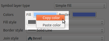
Just like the new colour dialog is heavily based off other colour dialog implementations, this new feature is inspired by Microsoft’s excellent colour buttons in their recent Office versions (I make no claim to originality here!). Now, all QGIS colour buttons come with a handy drop down menu which allows you to quickly choose from some frequently used colour shortcuts. You’ve got the previously available options of copying and pasting colours from 2.4, plus handy swatches for recently used colours and for other standard colours.

colour_menu

Handy colour menu for buttons

Part 3 – Colour palettes

You may have noticed in the above screenshot the “Standard colors” swatches, and wondered what these were all about.  Well, QGIS 2.6 has extensive support for color palettes. There’s a few different “built-in” color palettes:

  • The “Standard colors” palette. This palette can be modified through the Options → Colors tab. You can add, remove, edit, and rename colours, as well as import color schemes from a GPL palette file. These standard colours apply to your QGIS installation, so they’ll be available regardless of what project you’re currently working on.

    Customising the standard colours

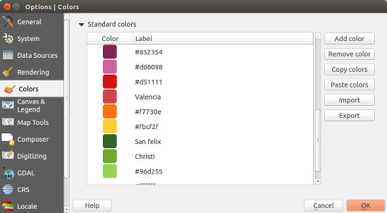
    Customising the standard QGIS colours

  • The “Project colors” palette. This can be accessed via the Project Properties → Default styles tab. This palette is saved inside the .qgs project file, so it’s handy for setting up a project-specific colour scheme.
  • The “Recent colors” palette. This simply shows colours you’ve recently used within QGIS.

You can easily create new colour palettes directly from the colour picker dialog. Behind the scenes, these palettes are saved into your .qgis/palettes folder as standard GPL palette files, which makes it nice and easy to modify them in other apps or transfer them between installations. It’s also possible to just dump a stack of quality palettes directly into this folder and they’ll be available from within QGIS.

Perhaps the best bit about colour schemes in QGIS is that they can be created using PyQGIS plugins, which opens up tons of creative possibilities… More on this in a future blog post!

So there we go. Tons of improvements for working with colours are heading your way in QGIS 2.6, which is due out on the 24th October.

(Before we end, let’s take a quick look at what the competition offers over in MapInfo land. Yeah… no thanks. You might want to invest some development time there Pitney Bowes!)

Tagged , , , ,

Shapeburst fill styles in QGIS 2.4

With QGIS 2.4 getting closer (only a few weeks away now) I’d like to take some time to explore an exciting new feature which will be available in the upcoming release… shapeburst fills!

As a bit of background, QGIS 2.2 introduced a gradient fill style for polygons, which included linear, radial and conical gradients. While this was a nice feature, it was missing the much-requested ability to create so-called “buffered” gradient fills. If you’re not familiar with buffered gradients, a great example is the subtle shading of water bodies in the latest incarnation of Google maps. ArcGIS users will also be familiar with the type of effects possible using buffered gradients.

Gradient fills on water bodies in Google maps

Gradient fills on water bodies in Google maps

Implementing buffered gradients in QGIS originally started as a bit of a challenge to myself. I wanted to see if it was possible to create these fill effects without a major impact on the rendering speed of a layer. Turns out you can… well, you can get pretty close anyway. (QGIS 2.4’s new multi-threaded responsive rendering helps a lot here too).

So, without further delay, let’s dive into how shapeburst fills work in QGIS 2.4! (I’ve named this fill effect ‘shapeburst fills’, since that’s what GIMP calls it and it sounds much cooler than ‘buffered gradients’!)

Basic shapeburst fills

For those of you who aren’t familiar with this fill effect, a shapeburst fill is created by shading each pixel in the interior of a polygon by its distance to the closest edge. Here’s how a lake feature polygon looks in QGIS 2.4 with a shapeburst from a dark blue to a lighter blue colour:

A simple shapeburst fill from a dark blue to a lighter blue

A simple shapeburst fill from a dark blue to a lighter blue

You can see in the image above that both polygons are shaded with the dark blue colour at their outer boundaries through to the lighter blue at their centres. The screenshot below shows the symbol settings used to create this particular fill:

A simple shapeburst fill from a dark blue to a lighter blue

Creating a simple shapeburst fill from a dark blue to a lighter blue

Here we’ve used the ‘Two color‘ option, and chosen our shades of blue manually. You can also use the ‘Color ramp’ option, which allows shading using a complex gradient containing multi stops and alpha channels. In the image below I’ve created a red to yellow to transparent colour ramp for the shapeburst:

Colour ramp shapeburst with alpha channels

Colour ramp shapeburst with alpha channels

Controlling shading distance

In the above examples the shapeburst fill has been drawn using the whole interior of the polygon. If desired, you can change this behaviour and instead only shade to a set distance from the polygon edge. Let’s take the blue shapeburst from the first example above and set it to shade to a distance of 5 mm from the edge:

Shapeburst fills can shade to a set distance only

Shapeburst fills can also shade to a set distance from the polygon’s exterior

This distance can either be set in millimetres, so that it stays constant regardless of the map’s scale, or in map units, so that it scales along with the map. Here’s what our lake looks like shaded to a 5 millimetre distance:

Shading to 5mm from the lake's edge

Shading to 5mm from the lake’s edge

Let’s zoom in on a portion of this shape and see the result. Note how the shaded distance remains the same even though we’ve increased the scale:

Zooming in maintains a constant shaded distance

Zooming in maintains a constant shaded distance

Smoothing shapeburst fills

A pure buffered gradient fill can sometimes show an odd optical effect which gives it an undesirable ‘spiny’ look for certain polygons. This is most strongly visible when using two highly contrasting colours for the fill. Note the white lines which appear to branch toward the polygon’s exterior in the image below:

Spiny artefacts on a pure buffered gradient fill

Spiny artefacts on a pure buffered gradient fill

To overcome this effect, QGIS 2.4 offers the option to blur the results of a shapeburst fill:

Blur option for shapeburst fills

Blur option for shapeburst fills

Cranking up the blur helps smooth out these spines and results in a nicer fill:

Adding a blur to the shapeburst fill

Adding a blur to the shapeburst fill

Ignoring interior rings

Another option you can control for shapeburst fills is whether interior polygon rings should be ignored. This option is useful for shading water bodies to give the illusion of depth. In this case you may not want islands in the polygon to affect their surrounding water ‘depth’. So, checking the ‘Ignore rings in polygons while shading‘ option results in this fill:

Ignoring interior rings while shading

Ignoring interior rings while shading

Compare this image with the first image posted above, and note how the shading differs around the small island on the polygon’s left.

Some extra bonuses…

There’s two final killer features with shapeburst fills I’d like to highlight. First, every parameter for the fill can be controlled via data defined expressions. This means every feature in your layer could have a different start and end colour, distance to shade, or blur strength, and these could be controlled directly from the attributes of the features themselves! Here’s a quick and dirty example using a random colour expression to create a basic ‘tint band‘ effect:

Using a data defined expression for random colours

Using a data defined expression for random colours

Last but not least, shapeburst fills also work nicely with QGIS 2.4’s new “inverted polygon” renderer. The inverted polygon renderer flips a normal fill’s behaviour so that it shades the area outside a polygon. If we combine this with a shapeburst fill from transparent to opaque white, we can achieve this kind of masking effect:

Creating a smooth exterior mask using the "inverted polygons" renderer

Creating a smooth exterior mask using the “inverted polygons” renderer

This technique plays nicely with atlas prints, so you can now smoothly fade out the areas outside of your coverage layer’s features for every page in your atlas print!

All this and more, coming your way in a few short weeks when QGIS 2.4 is officially released…

Tagged , , , , , ,

Colour shortcuts in QGIS 2.4

Quick poll… what’s the most frustrating thing about GIS? Fighting with colour plotters? Trying to remember GDAL command line syntax? MapInfo’s new ribbon interface* [1]? All of the above?

Wrong!

It’s getting a colour from here:

colour1

…all the way over to here:

colour2

Since the dawn of GIS humanity has struggled with this simple task* [2]. We’ve come up with multiple techniques for solving this problem, ranging from the RSI inducing “select and copy red value, alt-tab, paste, alt-tab, select and copy green value, alt-tab, paste, etc….” method, through to chanting “70, 145, 160… 70, 145, 160… 70, 145, 150… 70, 145, 150” to ourselves as we frantically try and rearrange dialogs to find the destination colour picker, all the while avoiding strange looks from co-workers.

Fortunately, QGIS 2.4 is coming to the rescue! Now, you can right click on any of QGIS’ colour picker buttons for a handy copy/paste colour shortcut menu. Pasting colours works from a whole range of formats, including hex codes, color names, and css-style “rgb” and “rgba” strings.

Fixed!

Problem solved!

Even better, you can just drag colours from one colour button to another:

Fixed again...

… and solved again…

Or, drag a colour from GIMP and drop it onto a QGIS colour button:

x

… and yet again!

Or even drag a colour from a QGIS button directly onto a shape in Inkscape! All this win is coming your way in QGIS 2.4, due June 2014.

[1] Pre-empting the inevitable flood of complaints when this new interface is rolled out
[2] I assume

Tagged , , , , , , , ,

And now… colour preview modes in QGIS’ map canvas

As a quick follow-up to my last post on colour preview modes for the print composer in QGIS 2.4, this feature has also been added to the main map canvas window! Now it’s even easier to adjust your symbol colours and immediately see how they’d appear under a range of different circumstances:

Colour previews modes for the map canvas

Colour previews modes for the map canvas


Tagged , , , , , , , ,

Colour blindness and grayscale previews in QGIS 2.4

Since QGIS 2.4 is nearing feature freeze it seems like a good time to start exploring some of the great new features in this release. So, let’s get started with my most recent addition to QGIS’ print composer… preview modes!

As every first year cartography text book will tell you, it’s important to know your target media and audience when creating a usable map. Some important considerations are whether or not your map will be photocopied or printed in black and white, and whether you need to consider colour blind map readers in your audience. In the past, designing maps with these considerations has been a time consuming, tedious process. You’d have to export your map, open it in another graphics editing program, apply some colour transform, work out what issues there are, flip back to QGIS, make your changes and repeat. If you’re working with a tight deadline it can be difficult to justify the time this all takes.

QGIS 2.4 will help to make this whole process a lot simpler. In the print composer there’s now an option to enable a number of different live “preview modes“. These include grayscale, monochrome, and two colour blindness simulations (Protanope and Deuteranope).

Composer preview modes in QGIS 2.4

Composer preview modes in QGIS 2.4

These preview modes are live, so you can continue to edit and tweak the colours in your composition while a preview mode is active! For a quick demonstration, let’s start with this creatively coloured thematic map:

bad_colored_map

While it might not be the most aesthetically pleasing map, at least the thematic colours can be easily matched to their corresponding values in the legend. Let’s see what would happen if we photocopied this map. This is as easy as activating the “Simulate photocopy (grayscale)” preview mode:

greyscalepreview

Hmm… not so usable now. The five thematic colours have been reduced to just three discernible colours. Oh well, at least we haven’t had to export our map to find this out, and it’s nice and easy to adjust the colours and composition to work for photocopies without having to leave QGIS to test the results!

Let’s see how this map would look to someone with colour blindness, by activating the “Simulate colour blindness (Protanope)” mode:

color_blindness

In this case, our map isn’t too bad. The different classes are still discernible and the map can be interpreted by someone with protanopia.

So there we have it – now it’s easy to determine how our map outputs will look under different circumstances and adjust them to suit! Composer preview modes will be a part of the upcoming 2.4 release of QGIS, which is due out at the end of June 2014.

Update:

This feature has also been added to the main map canvas.

Tagged , , , , , , ,

Composition styling in QGIS 2.2

Here’s a quick run-down on some new feature in QGIS 2.2 which I never got around to writing about before the release. I feel like I’ve got to give these features their due publicity before moving on to all the exciting new stuff which is being added for 2.4. So, without further ado, let’s take a dive into print composer shape and page styling in QGIS 2.2…

Shape styling

It’s no secret that QGIS has pretty impressive capabilities when it comes to cartographic styling of polygon features. Everything from line and point pattern fills, SVG image fills, gradients and even buffered gradients (new in 2.4 — more on that in a later post) can be used to shade polygons. That’s all in addition to the whole range of line styles which can be used to outline the edges of polygons. In QGIS 2.2 all these fill effects are now available for styling shapes in the print composer. What exactly does this mean?

Well, now you can draw a frame onto your print layout and style it with a gradient fill…

Gradient shape fill in composer

…or a line pattern fill….

Line pattern fill in composer

…or some crazy combination of everything…

Advanced fill in composer

It’s totally up to you how far you take this! Here’s a nice example of a map created in QGIS 2.2’s print composer using these new styling options.

Page styling for compositions

Why is this cool? Well, for a start, if we take a quick look at the QGIS map showcase on Flickr very few of the maps shown there have a white background. In previous versions of QGIS achieving a non-white background would require drawing a giant coloured rectangle over your whole composition, banishing it to the back of the stack, and then continually being annoyed by it getting in the way while you tried to work on the rest of the composition. Now, just like the shape styling described above, you can style the page background using any of the available options in QGIS for polygon fills!

Creating a composition with a black page background

Creating a composition with a black page background

It doesn’t end there though. Since the page background can now be styled like this, it’s also possible to have transparent or semi-transparent page backgrounds. I’ll show the result opened here in GIMP so that you can see the full transparency effect over GIMP’s checkerboard background pattern:

A composition exported with a transparent background

A QGIS 2.2 composition exported with a transparent background

Using a transparent composition background like this also allows for transparency effects in map layers to show through – so, for instance, if your map layer is set to 50% transparent then the resultant export from the composer will also be 50% transparent.

And now for the final stinger…

Have I mentioned yet that you can also use data defined symbology for both shape and page styling? No? Well, this was actually my main motivator in adding styling support to these elements. For a long time I’ve been wanting to create atlases which vary the page background based on attributes in the atlas coverage layer. Think flip-book style maps, where the page border is colour-coded to highlight areas that need attention. For example, areas with high rates showing with red borders, average rates with yellow, and low rates with green borders. Using a combination of page and shape styling, data defined symbology, and QGIS’ atlas features, this is now possible!

…And that (belatedly) wraps up my exploration of new features in QGIS 2.2. Next up I’ll start showcasing all the sweet new features which have landed for 2.4…

Tagged , , , , ,

Two book recommendations

I recently finished reading two books which may be of interest to open-source GIS users – “PostGIS Cookbook” and “The PyQGIS Programmer’s Guide“, both of which I highly recommend:

PostGIS Cookbook

PostGIS CookbookI’ve been a fan of Stephen Mather’s blog for a while now, and have consistently found it to be a great source of trustworthy information and creative solutions to GIS problems. So when I first saw mention of his work on the PostGIS Cookbook I knew it would be a must-read for me. PostGIS is an essential part of my daily toolkit, and I’ll quickly devour any tutorial or guide which can lead me to better ways to put it to use. And that’s exactly what this book is! It’s full of tips and guides which has inspired me in a lot of techniques I’d never tried or even thought possible in PostGIS.

It’s important to point out that this book isn’t a training manual or beginner’s guide to PostGIS. It assumes readers are already familiar with using PostGIS and have a good understanding of GIS software in general. (If you’re looking for a book to start from scratch with PostGIS, PostGIS in Action is a better fit). I think that’s really what makes this book stand out though. There’s currently not a lot of books available covering PostGIS, and as far as I’m aware the PostGIS Cookbook is the only book available which is targeted to experienced PostGIS users.

Highlights for me are:

  • A great explanation and write up on optimised KNN filtering in PostGIS (something which often trips me up)
  • The detailed guide to topologically correct simplification of features
  • The exploration of PgRouting, which is a great introduction to PostGIS’ routing abilities
  • The “PostGIS and the web” chapter – I really wasn’t expecting this, but it’s quite eye opening (I’m going to have to do some digging into GeoDjango sometime)

The only criticism I have with this book is that it jumps around a lot between operating systems. While most of the code is provided for both Linux/OSX and Windows, there’s occasional examples which only have code for one specific operating system. It’s a little jarring and assumes the user is well versed in their particular operating system to workaround these omissions.

Overall, I strongly recommend the PostGIS Cookbook, and would consider it a must have for anyone serious about expanding their PostGIS abilities. (Also, looks like the publisher, Packt, have a two-for-one sale going at the moment, so it’s a good time to grab this title).

The PyQGIS Programmer’s Guide

The PyQGIS Programmer's GuideThe second book I’ve just finished reading is Gary Sherman’s “The PyQGIS Programmer’s Guide“. For those who are unaware, Gary was the original founder of QGIS back in 2002, so you can be confident that he knows exactly what he’s writing about. In The PyQGIS Programmer’s Guide  Gary has created an in-depth guide on how to get started with programming for QGIS using python. It takes readers all the way from simple scripts right through to developing QGIS plugins and standalone applications based on the QGIS API.

This book fills an important void in the literature available for QGIS. Previously, the PyQGIS Developer Cookbook was the only available guide for QGIS python scripting, and unfortunately it’s a little out-of-date now. PyQGIS scripting can be a steep learning curve and that’s why this book is so appreciated.

It would be valuable to have some python knowledge and experience prior to reading this book. While the “Python Basics” chapter quickly runs through an introduction to the language, the book makes no claims to be a comprehensive python tutorial. But if you’ve dabbled in the language before and have familiarity with the python way of doing things you’ll easily be able to follow along.

Highlights are:

  • The “Tips and Techniques” chapter, which is a great mini-reference for performing a range of common tasks in PyQGIS (including loading layers, changing symbol styles, editing feature attributes, etc).
  • A complete tutorial for creating a QGIS plugin
  • A guide to debugging PyQGIS code and plugins

I’d definitely recommend that anyone who wants to get started with PyQGIS start with Gary’s work – you’ll find it the perfect place to begin.

Tagged , , , , ,

Atlas previews in QGIS 2.2

QGIS 2.2 includes some great additions to the map composer’s “Atlas” feature. If you’re not familiar with atlas prints they are QGIS’ equivalent of ArcGIS’s “data driven pages”, or something like a map based version of Microsoft Word’s “mail merge”. In an atlas composition you can select one of your map layers to use as a “coverage layer“, and QGIS will automatically generate multiple pages from the composition with each page highlighting a different feature from this coverage layer.

Atlas Previews

Thanks to funding from SIGE, I’ve added some useful new features to QGIS’ atlas abilities for 2.2. The first of these is the ability to preview atlas compositions before printing them. In QGIS 2.0, atlas generation took a bit of guess work. You’d set up the parameters for the atlas, then export the whole atlas in one shot and just hope you’d got the settings right. If not, you’d have to tweak the settings and export the whole lot again to see the result. But not any more! Now, in QGIS 2.2, you can switch on a live atlas preview mode by clicking “Preview Atlas” in the new atlas preview toolbar:

The new atlas preview toolbar

The new atlas preview toolbar

The composer window will switch to showing you a preview of exactly how the atlas will look when exported. You can tweak the appearance of any layout item, adjust the atlas and map parameters, or experiment with the new options for atlas feature styling to see instantly what the final export will look like.

The composer window in atlas preview mode

The composer window in atlas preview mode (complete with gratuitous use of label rotation and rounded rectangles…) 

When this Atlas Preview mode is enabled, you navigate through all the features in the coverage layer by clicking any of the navigation buttons in the atlas preview toolbar:

Navigating the atlas preview

Navigating the atlas preview

While previewing you can export individual pages from the atlas. So, if just one or two pages in your atlas need to be individually tweaked you can do that as you step through the features. A neat thing with this is that you can make temporary tweaks to the extent and scale of the map items as you go, without affecting how the rest of the atlas maps look.

(Oh, by the way, I should mention that as an added bonus QGIS 2.2 lets you control more than one map with an atlas print!)

Selecting the current atlas feature

The second part of the work funded by SIGE was creation of shortcut actions for selecting the current atlas feature. If your atlas coverage layer has many records it may not be practical to step through the atlas previews one at a time until you find a specific feature. That’s where these new shortcut actions come in handy!

There’s a few ways of jumping directly to a specific atlas feature. The first is to open a browser window for your coverage layer, then right click a row and choose “Set as atlas feature for …“:

Setting the atlas feature from the browser window

Setting the atlas feature from the browser window

Selecting this menu item will cause the composer to immediately jump to the matching atlas row. Another way of selecting the current atlas feature is to use the “Set as atlas feature” map action. You activate this by first selecting your coverage layer in the layers panel, then clicking the “Run Feature Action” tool button and selecting “Set as atlas feature…“:

The set atlas feature map action

The set atlas feature map action

The mouse cursor will change to a cross-hair, and clicking any matching feature in the map window will cause the composer atlas preview to jump straight to that feature. Lastly, you can also activate the “Set as atlas feature” action directly from the identify results window.

That’s just a small taste of some of the new atlas creation features which will be available in QGIS 2.2, coming your way by the end of February 2014!

(One last note – as mentioned, this work was kindly sponsored by SIGE. If there’s a specific composer based feature or bug you’d like me to work on, I’m available for further sponsored work. Just contact me directly for details.)

Tagged , , , , ,

QGIS – Two neat features in 2.2

Here’s a quick run-down on two nice new styling options which I’ve recently added to QGIS 2.2.

Map styling for compositions

This little feature was suggested by Mathieu Pellerin, who is always pushing the boundaries of QGIS’ cartographic tools and coming up with great ideas for new styling features (you can check out some of his work via Flickr). Mathieu’s idea was for a new ‘$map‘ variable for the expression builder. This variable holds the id of the map item which is drawing the map, and allows for some nice tweaking of maps in the composer.

The $map variable is most useful when you have more than one map in your composition. The example below shows $map being used to change the styling of a single layer from the main map to the smaller inset map:

Using $map to style two maps with different colours

Using $map to style a single layer in two maps with different colours

In this example the composition has two maps, the larger has an id of “main_map” and the smaller has “inset_map“. The boundary layer has been styled using the rule based renderer, with one rule for $map=’main_map’ and one for $map=’inset_map’, as shown below:

Rule based rendering using the $map variable

Rule based rendering using the $map variable

The end result is that the layer will be rendered using the two different styles depending on which composer map item it is being drawn into. This trick can also be used to tweak labelling rules between the maps. In the example above I’ve restricted the labelling to only show in the main map. This is achieved by setting an expression for the data defined “Show label” property. I’ve used the expression “$map=’main_map’” so that labels are only shown in the main map and not the smaller inset map.

Tweaking label settings using the $map variable

Tweaking label settings using the $map variable

This small addition to QGIS 2.2 allows for some rather powerful improvements to multi-map compositions!

Drawing polygon borders only inside the polygon

The second new feature I wanted to highlight is a new option for polygon outlines which causes the outline to be drawn only on the inside of a polygon feature. The usual behaviour is for outlines to be drawn directly over the centre of the feature boundary, so that half of the outline is drawn inside the feature and half on the outside.

Simple Line Fill before

This means that the outline in a simple line symbol layer overlaps into the neighbouring polygons, and the result is that outlines from these features blend together:

Shaded borders pre QGIS 2.2

Shaded borders pre QGIS 2.2 – see how the colours bleed into the neighbouring features and overlap

This looks like a big muddy mess. A feature I’ve wanted for a long time is the ability to restrict these outlines so that they are only drawn inside the feature. This effect is commonly seen in world atlases and National Geographic maps, where each neighbouring country is shaded with it’s own unique outline colour. Now it’s possible to do this in QGIS just by ticking a single box!

The new "Draw line only inside polygon" option

The new “Draw line only inside polygon” option

As you can see in the above image, the simple line outline style has a new checkbox, “Draw line only inside polygon“. Ticking this box will clip the outline so that only the portion of it which falls inside the feature is rendered. Here’s the result:

Shaded borders with "Draw line only inside polygon" checked

Shaded borders with “Draw line only inside polygon” checked

So much nicer then the earlier output – now none of the borders overlap into their neighbouring regions! Ok, so it is possible to achieve a similar result by creating a specially crafted layer consisting of negatively buffered polygons subtracted from the original polygons, but this takes a lot of fiddling around. It also has the major disadvantage in that the result is scale dependant, and zooming in or out of the map will alter the size of the polygon outlines. But using this wonderful new checkbox in QGIS, we get proper scale-independent borders, and zooming in or out of the map keeps a consistent border width!

Zooming in keeps a consistent border width...

Zooming in keeps a consistent border width…

So there we go – two small new features added in QGIS 2.2 which have huge potential for your cartographic outputs! As per usual, if you come up with some fancy way of utilising these, don’t forget to add your maps to the QGIS Showcase on Flickr.

Tagged , , , , , ,

Waiting for QGIS 2.2 – Composer Improvements (part 3)

Following on from parts 1 and 2, here’s some more composer changes which are coming in QGIS 2.2

  • Rotation support for all composer item types. Now anything you draw in a composer can be rotated, including scale bars, legends, attribute tables and html frames! Rotation of text labels has also been improved by making the border and background of labels respect the rotation of the label.
Every composer item can now be rotated...

Every composer item can now be rotated…

  • Resizing of rotated items has been improved. Now it’s possible to easily resize rotated items while keeping their correct shape. (There’s still one missing ingredient for complete support here – shear/perspective transforms. Unfortunately this will probably have to wait till 2.4).
Better resizing of rotated items

Better resizing of rotated items

  • Rulers can be shown or hidden in compositions
  • The ruler appearance has been tweaked, adding smaller divisions and better text placement
The ruler appearance has been tweaked

New tweaked appearance for rulers

  • A zoom to actual size button and short cut (Ctrl + 1) have been added
Zoom to 100%

New Zom to 100% button

  • Lastly, the status bar has a new zoom combo box, which shows the current zoom level and allows for quick zoom to several predefined levels. You can also enter an exact zoom level in the box for precise control.
New zoom levels combo box in the status bar

New zoom levels combo box in the status bar

As you can see, the print composer in QGIS 2.2 just keeps getting better! There’s a few other really exciting new additions which have landed recently too, but they deserve their own blog posts. Stay tuned…

Tagged , , , ,