It’s been quite some time since I last had a chance to blog and a lot has happened since then. Not least of which is that QGIS 2.12 has now been released with a ton of new features that I’ve neglected to write about! To try and get things moving along here again I’m planning on writing a short series exploring how variables work in QGIS 2.12 and the exciting possibilities they unlock. First, let’s look into how variables can be used with QGIS map composer…
So, let’s get started! A new concept introduced in QGIS 2.12 is the ability to set custom variables for use in QGIS’ expression engine. The easiest way to do this is through the “Project Properties” dialog, under the “Variables” section:

Default project variables
You’ll see in the screenshot above that a blank project includes a number of read-only preset variables, such as @project_path and @project_title. (All variables in QGIS are prefixed with an @ character to differentiate them from fields or functions). You can add your own variables to this list by clicking the + button, as shown below:

Adding new variables to a project
Here I’ve added some new variables, @project_version and @author. Now, any of these variables can be used anywhere that you can use expressions in QGIS, including the field calculator, data defined symbology, labelling, map composer text, etc. So, you could make a map composer template with a label that includes the @author, @project_version and @project_path variables:
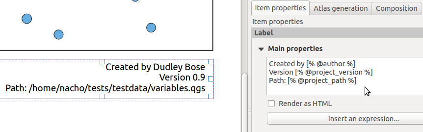
Variables in a composer label
Sure, you *could* also manually enter all these details directly into the label for the same result. But what happens when you have multiple composers in your project, and need to update the version number in all of them? Or you move your project to a new folder and need to make sure the path is updated accordingly? Manually updating multiple composers is a pain – make QGIS do the work for you and instead use variables! This would especially be helpful if you’re saving map composer templates for use across multiple projects or users. Using variables will ensure that the template is automatically updated with the right details for the current project.
Another neat thing about QGIS variables is that they can be inherited and overridden, just like CSS rules. Opening the options dialog will also show a Variables group for setting “Global” variables. These variables are always available for your QGIS installation, regardless of what project you’re working on at the time. If your workplace tends to reorganise a lot and constantly shuffle your department around, you could add a global variable for @work_department, so that changing the global variable value in one place will automatically filter through to any existing and future projects you have.

Global variables
And like I mentioned earlier, these variables are inherited through various “contexts” within QGIS. If I reopen the Project Properties dialog, you’ll see that a project has access to all the global variables plus the variables set within that specific project. In addition, by adding a variable with the same name to the Project variables the value of the Global variable will be overridden:
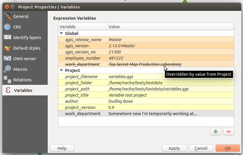
Overridden variables
There’s also a variable editor within each individual composer’s properties tab, so variables can also be set and overridden on a composer-by-composer basis within a project. It’s a really flexible and powerful approach which both simplifies workflows and also opens up lots of new possibilities.
Stay tuned for more on this topic – this topic has only just scratched the surface of how expression variables have changed QGIS! (You can also read part 2 and part 3)